A Growing Design Trend
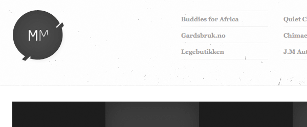
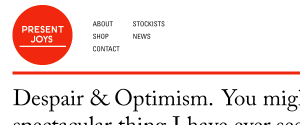
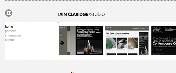
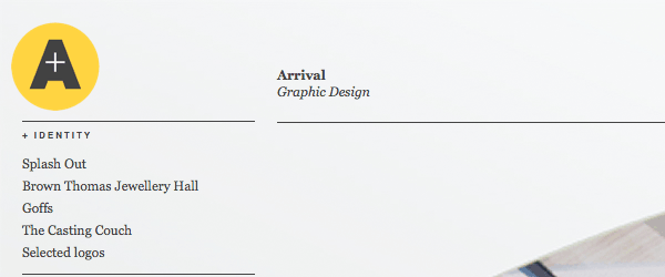
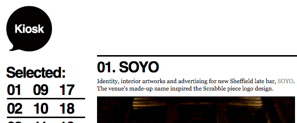
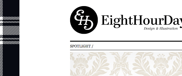
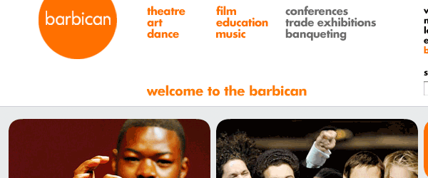
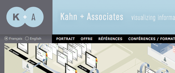
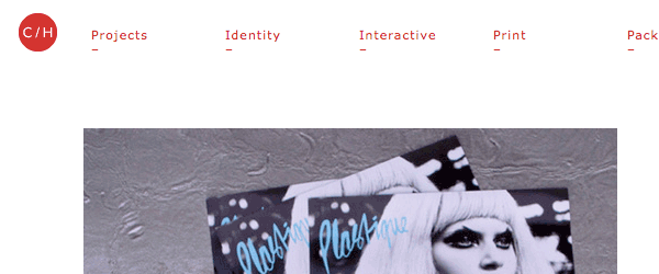
In the last 6 months I’ve noticed more and more sites popping up with circular logos, and more often than not they sit in a minimal design.
Why is this?
Well i don’t think its a case of copycat mentality, or designers adopting a specific design style in order to be trendy. Its more to do with balance and composition. Minimal sites are focused on simplicity and because their interfaces are based around grid layouts and limited color palettes, it means the page is usually flat and square in its appearance.
Why Circles?
Minimal Design is generally characterised by the absence of rounded corners, gradients and drop shadow and an abundance of white space and straight lines. Because of this the circle is a perfect shape to make a logo standout from the rest of the page whilst keeping the design simple and clean and minimizing visual distractions, in effect maintaining the delicate balance that minimal design requires
Here’s 35 examples of the circle at work.









Arnaud Alves | Graphic Design & Art Direction

MAUD | Branding, design and awesomeness




b











Discussion 4 comments so far. + Add Comment-
 Ted Sands February 20th, 2010 at 9:49 pm
-
 webdesign den haag February 27th, 2012 at 8:11 pm
-
 http://tinyurl.com/arliroddy21500 January 23rd, 2013 at 4:24 am
-
 Web Design Services March 19th, 2013 at 3:03 am
The similarities aren’t just in the shape, a lot of these examples feature logos of a similar size. I think this is purely down to the fact that designers follow web conventions and are sticking to what is widely regarded as the most acceptable size for a logo. Nice list
awesome topic. thanks
I personally blog also and I?m posting a thing comparable to this blog,
?35 Minimal Sites with Circular Logos | Trends Web Design Inspiration?.
Do you really care if Iwork with a lot of of your personal points?
Thanks for the post ,Gwendolyn
I have read several excellent stuff here. Definitely value bookmarking for revisiting. I surprise how much attempt you place to create any such magnificent informative site.