So what is microcopy and why should you bother reading any of this?
Well, I like to think of microcopy as those little phrases that help to allay any fear or confusion.
We encounter microcopy each and every day without even realising it. It’s a “Pull” sign on a door, it’s a box that says “this way up”.
Online, microcopy can be that little piece of UX magic which brings a smile or creates a sale. Joshua Porter set up a flickr group dedicated to microcopy and here’s a few examples of where it’s done well:

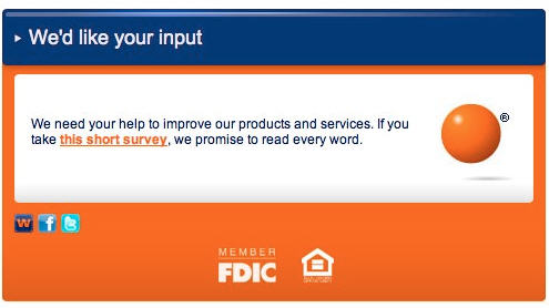
Two things here – “this short survey” allays any fear about spending hours completing a mammoth form and “we promise to read every word” encourages you that you’re not wasting your time.

“Don’t worry, we’ve emailed you all this as well” – just at the point that you’re wondering.

Seen this approach quite often, lovely eh?

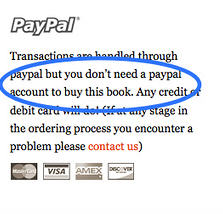
If you insist on using PayPal, at least tell your users that they don’t need an account as per the above example.

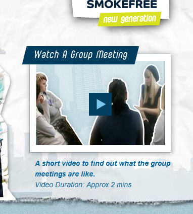
“Video Duration: Approx 2 Mins”. By stating that the video is actually quite short, you encourage people to give it a go.
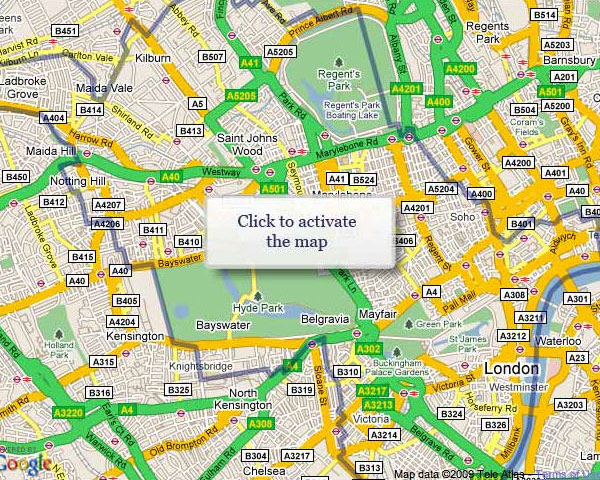
Microcopy is powerful. However, done badly, it can cause huge frustration. During a recent usability study, we looked at a local authority website for research purposes. The authority in question had a few issues with their interactive map load time. They decided against auto-loading the map and instead they wanted the user to click on it to bring it to life. The result was an aggressive command:

Bearing in mind that the home page features way too much choice, users find it hard deciding on the first step to take. The map then leaps out like their saviour!
Sadly, the map turns out to be utterly useless and the user feels like they’ve been tricked. I witnessed the frustration first hand. I heard one old lady actually growling.
Microcopy is hugely important and more often than not the responsibility for getting it right falls to the interface designer.
Consider your journeys and think about those little touches you can add that will help to allay any fear or confusion. More pleasure, less pain.
It goes a long way.


Discussion 3 comments so far. + Add Comment-
 Steph September 15th, 2010 at 9:33 pm
-
 Ygam Retuta September 16th, 2010 at 1:07 am
-
 san diego listings December 1st, 2010 at 10:29 pm
Thanks for the tip and definition. Almost feels like it should be called “helpfulcopy” or something. Thought it had to do with microformats.
I have observed that informal phrases for microcopy seems to put most users at ease rather than formal ones. It is much like how one can say “Give it a go, man.” better than “We urge you to proceed.”
Good explanation Andy, some times its annoying also.