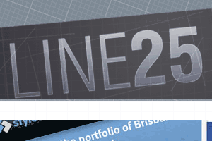
A feeling of depth has been achieved by overlapping divs, and using transparnecies. I also like the diagonal lines to help loosen up this layout and prevent it from feeling to square and boxy. There’s nothing wrong with a mono palette but i’m sure a little bit more colour wouldn’t offend anyone!


No Discussion Comments Are Closed